"Acesso Corp" was a challenge because, in addition to thinking of a practical and secure way of providing access to a payment method for business, it went beyond, it also became a way to organize corporate finance on a safe and straightforward platform.

Campaign photo of the publicity of the product, were tested some photos to see which created greater identification with the target public.
In Brazil, there is a big bureaucracy for micro, small and medium companies to get a credit card, either because of the difficulty of proving their billing, because some are credit blocked, or other reasons. But in any case, companies usually need a credit card, or as a form of payment, which is often the only one accepted, especially in the virtual environment, or to organize the finances of a project, for example.
In general, banks are seen as a hindrance, imposing a lot of bureaucracy to obtain a credit card, and as a consequence, clients end up treating their banks with some indifference.

One of the co-creation processes that were done throughout the development of the product.
Discovery Phase
As soon as I accepted the challenge, I became fully aware of the goals of this new product with its managers, and from then on I had to understand in detail how all the company's business credit card processes worked. Because a legacy product already existed to some customers, and this product had already proven inefficient, one reason was that it did not have a friendly platform and it was not scalable either. Previously in this first phase, it was possible to map the users' journey, and I realized that there were already several points that could be better explored.
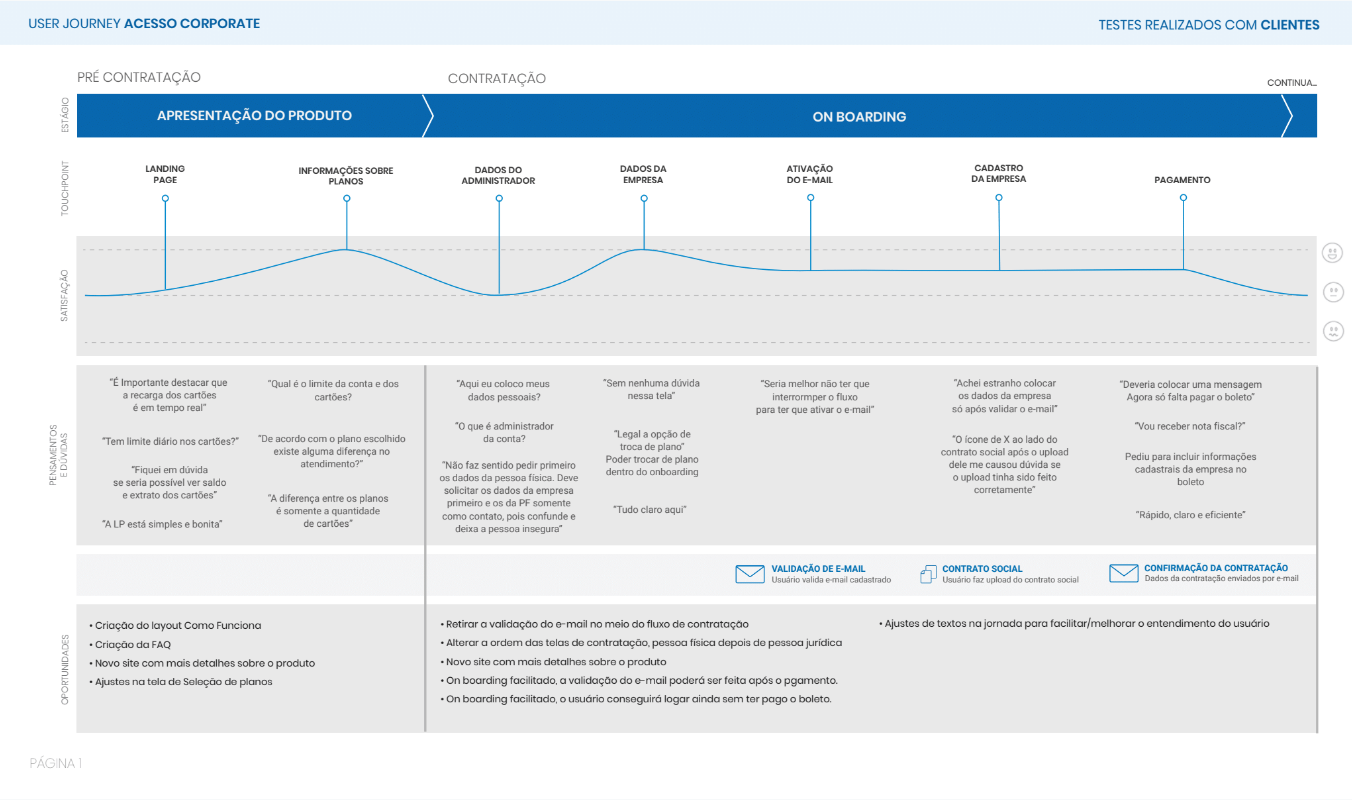
Excerpt from the user's journey document
To map all the gaps of the legacy product, I interviewed the main stakeholders from all areas of the company, to have a complete view of the process and the participation of each one of them in the day. I used a framework of questions that I created to be able to map the whole process of each area, thinking about the complete journey of the client.
After a few interviews, I decided to do a co-creation work and bring the interviewees together to create a diagram of affinities, since I had realized that many patterns had already been repeated. But there were conflicting views between the areas of standard processes, this worried me and then decided to carry out this activity together so that in the end everyone had the same look on the processes, this helped a lot to outline the next activities of the product and gave me enough security to continue.

A small part of the affinity diagram that helped discover different views across teams about processes was extremely helpful in putting everyone on the same page and finding patterns that were useful in developing the entire project.
The next step was to interview the main customers, there were ten more interviews, among these clients, I chose those that were micro to medium-sized companies and those that had few prepaid credit cards in the legacy system, to be able to capture the maximum of insights different.
The interview phase was excellent because, in addition to having validated many of the points that had been raised with the company's internal areas, I also discovered several new ones. And at that point, it became clear that companies needed not only prepaid credit card but a corporate spending management platform that could have dashboards, report, and even integration with internal tools.
Demographic data, behavior, pain points and potential solutions were used to set up the personas. To consolidate the characteristics of each profile, we explore simple visualization formats - such as boards and posters. Over time and with more data available, these personas were enriched, the main personas were:
- Prepaid credit card user
- Business administrator user
- Administrator user who also had a prepaid credit card
- Business administrator user
- Administrator user who also had a prepaid credit card
With all the insights generated in the interviews, it was possible for me and for the PO of the project to assure ourselves what the features should be in the MVP of the project launch. Since the initial version of the product would only have the basic functionalities and we would evolve the product according to the learning with customers and their demands.
Then I started to prototype low-fidelity ideas for the solution, and the prototypes were made in Sketch on paper or using Mockup Balsamiq, later I chose the card sorting and treejack to start validating the information architecture. Since it became clear that both for the employees of the Access areas, as well as for the clients, there was no standardization for the terminologies used, nor for where they could be found in the product, from there I was able to standardize the terms and create the Menu Map of the App.

Treejack test that validated with the App Information Architecture clients.
Throughout the project I have always had my mind these questions:
Will users pay for this product?
And based on all the interviews, co-creation rounds and usability tests it was pretty clear that, yes, the product was solving a problem, which was the difficulty for some companies to get a prepaid credit card, and also to manage their financial expenses in a simple, organized and safe way.
And based on all the interviews, co-creation rounds and usability tests it was pretty clear that, yes, the product was solving a problem, which was the difficulty for some companies to get a prepaid credit card, and also to manage their financial expenses in a simple, organized and safe way.
Will users know how to use this product?
With the result obtained in the last usability tests, the average about user satisfaction/ease of use was 4.8. The product was tested with 15 real users of different profiles.
With the result obtained in the last usability tests, the average about user satisfaction/ease of use was 4.8. The product was tested with 15 real users of different profiles.
Is the product feasible to be developed?
I've involved the technical team since the first brainstorms, inviting the technical leader to attend some sessions, to get a clear idea of what the technical challenge would be. And to be able to anticipate on technology issues, and also be able to help build the product in the best possible way, avoiding the appearance of reasonable technical restrictions, when the product was already in the development phase.
I've involved the technical team since the first brainstorms, inviting the technical leader to attend some sessions, to get a clear idea of what the technical challenge would be. And to be able to anticipate on technology issues, and also be able to help build the product in the best possible way, avoiding the appearance of reasonable technical restrictions, when the product was already in the development phase.
How will success be measured?
I established with the PO that success would be measured by the number of companies that contracted the product, the rate of tasks done successfully, time is taken in each task, and the degree of customer satisfaction (product NPS)
I established with the PO that success would be measured by the number of companies that contracted the product, the rate of tasks done successfully, time is taken in each task, and the degree of customer satisfaction (product NPS)
Functionalities
The central premise guiding the project was simplicity, and that set all the features.
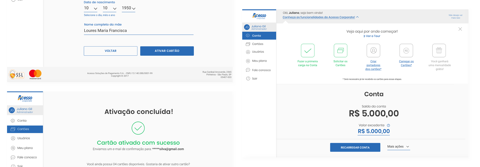
Onboarding
The simplified registration, with only three steps, in the first registration data of the administrator user, the second company registration data, and the third payment data, everything could be done in up to 5 minutes.
Unlocking the cards
After the user received the cards, all they had to do was open them and name their users.
After the user received the cards, all they had to do was open them and name their users.
Reload the cards
The next step was to make a charge of the amount that would be available on each credit card.
The next step was to make a charge of the amount that would be available on each credit card.
Management of expenses
Both the company account administrator, and the user of each card, access to a dashboard for managing expenses, according to their access profile.
All this could be accessed in the mobile version or on the web version.
Launch
After the launch of the product, we noticed that there was a need to leave in a totally clear, and always present for the users the four main tasks that should be performed before starting to use the product.
- Initial charge on account
- Unlock the cards
- Reload the cards
I created a Wizard-like UI component, quite visual, and with a simple model inspired by the concept of "gamification" where after the user performs each of these steps. The box related to the step had a check icon in green, showing that he could already jump to the next step. In the end, he received a prize for having performed all the steps.
After the delivery of the MVP, more usability tests were made, which fueled the backlog and which continued to be prioritized in the Moscow concept, all "must have" and "should have" demands were implemented in the next sprint after being discovered with the customers.
The initial feedbacks were great, the MVP averaged 4.5 in terms of ease of use, after the end of the usability tests customers rated the ease of use on a score between 1 and 5.
After creating the most common streams that were created for MVP, we had a reasonable and diverse volume of screens. We reviewed the material to identify patterns and set a limited number of templates. With pre-defined screens, it was less challenging to untangle alternative scenarios. Dozens of variations for routine actions, such as making a deposit, were detailed. The templates also allowed the division of labor between teams, without compromising the consistency in detailing the areas.
From there it was possible to create a design system, which served as the basis for the evolution of the product.
Acting
The project started in November 2017, and I remain in it until today, and my activities were
Strategy
Collaborate with the PO and PM to create the vision of the project; lead the UX design team in creating strategic deliverables.
Creation
Collaborate with design and technology team in the early conception phase; interviewing stakeholders and clients, leading UX design team in the production of interface and prototypes; collaborate with product management, design, writing and technology teams in the development phase; prepare and conduct tests with users, feed the KPIs and evolve the product considering them.
Business Management
Leading daily interactions with senior stakeholders; guide executive presentations with C-level.
Tools
- Jira: Our primary project management tool, Jira was always open on our browser and was used to track the progress of our stories.
- Confluence: Our primary area for documentation. The design team would work during a sprint to document the behaviour, styling and interaction of a feature which would then be referenced by both the developers and testers.
- Slack: We sat together but still used Slack constantly.
- Sketch: Our go to tool for design.
- Rapid prototyping: Drawing on the paper to get quick feedback or using Balsamiq Mockups to tests initial concepts using
wireframes
- InVision: InVision was used in many cases, both for rapidly testing a workflow and to help explain a complex interaction. We would often build out an interaction in InVision and then screen record to form part of our documentation. This proved highly effective in helping developers and testing understand how the feature should behave.
Challenge and Results
One of the biggest challenges of the project was mapping the market, discovering the primary needs and desires of the users in relation to the product, because at the beginning of the project it was suspected that the customers needed only to have access to a business credit card, far beyond, they wanted a secure and straightforward expense management tool.
And for this we have created a platform that allows users to view all spending through dashboards and reports, as well as admin users have full power management capabilities, placing/withdrawing money from cards in real time, blocking, requesting new cards, among other features.
Another major challenge of the project was the initial deadline for MVP's launch, which was only four months when I joined the project, with a small team of professionals, this can be solved by focusing strictly on the necessary functionalities for the user, product.
These were the main results six months after launch:
- 5000 clients captured with the launch of MVP (in the first three months)
- User Experience Note 4.5
- More than 80% of customers rated the ease of use as 5 (from 1 to 5).